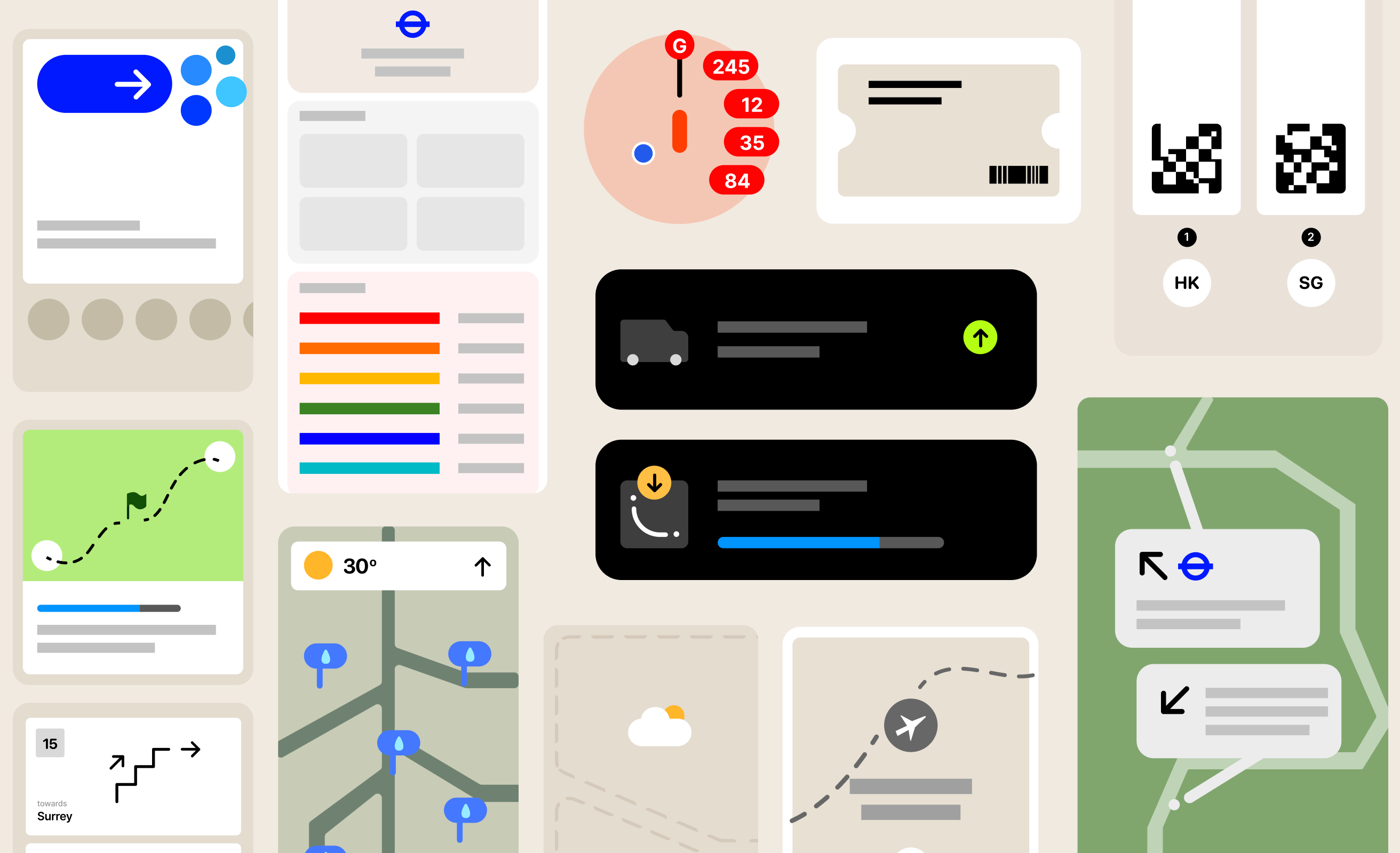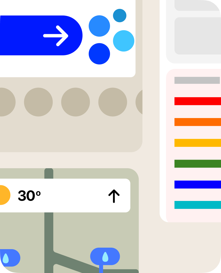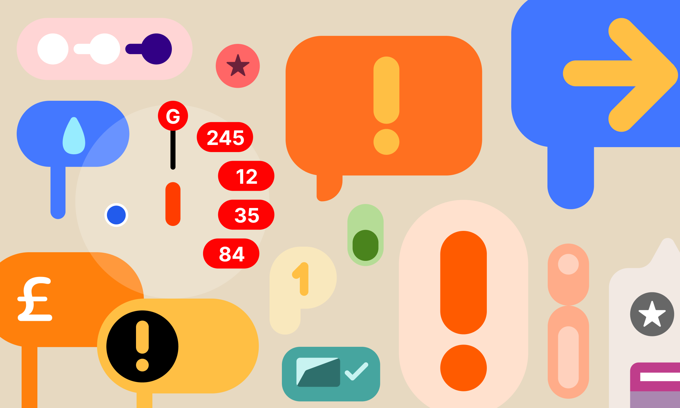

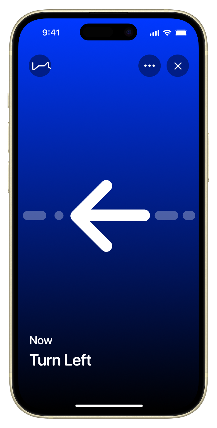
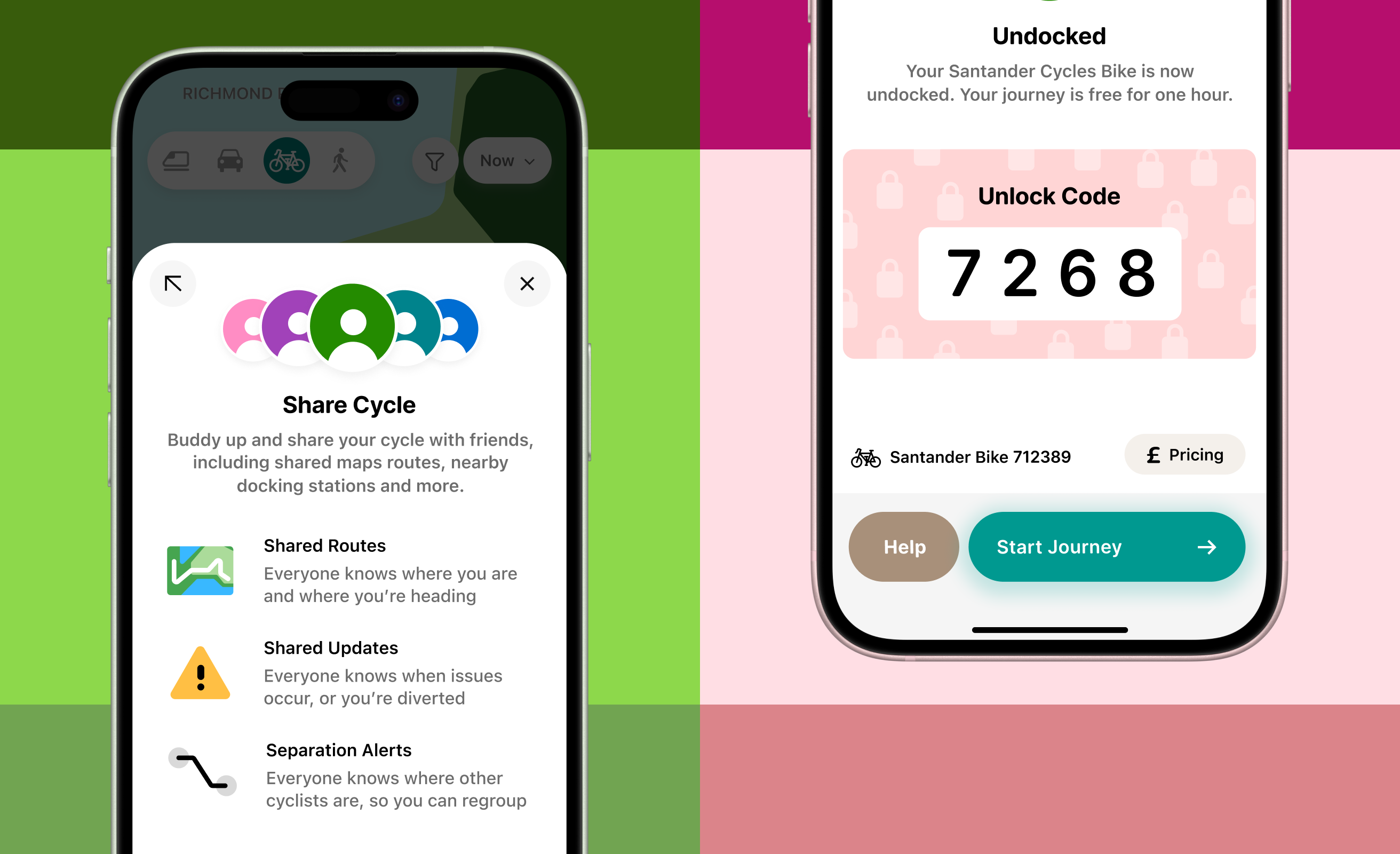
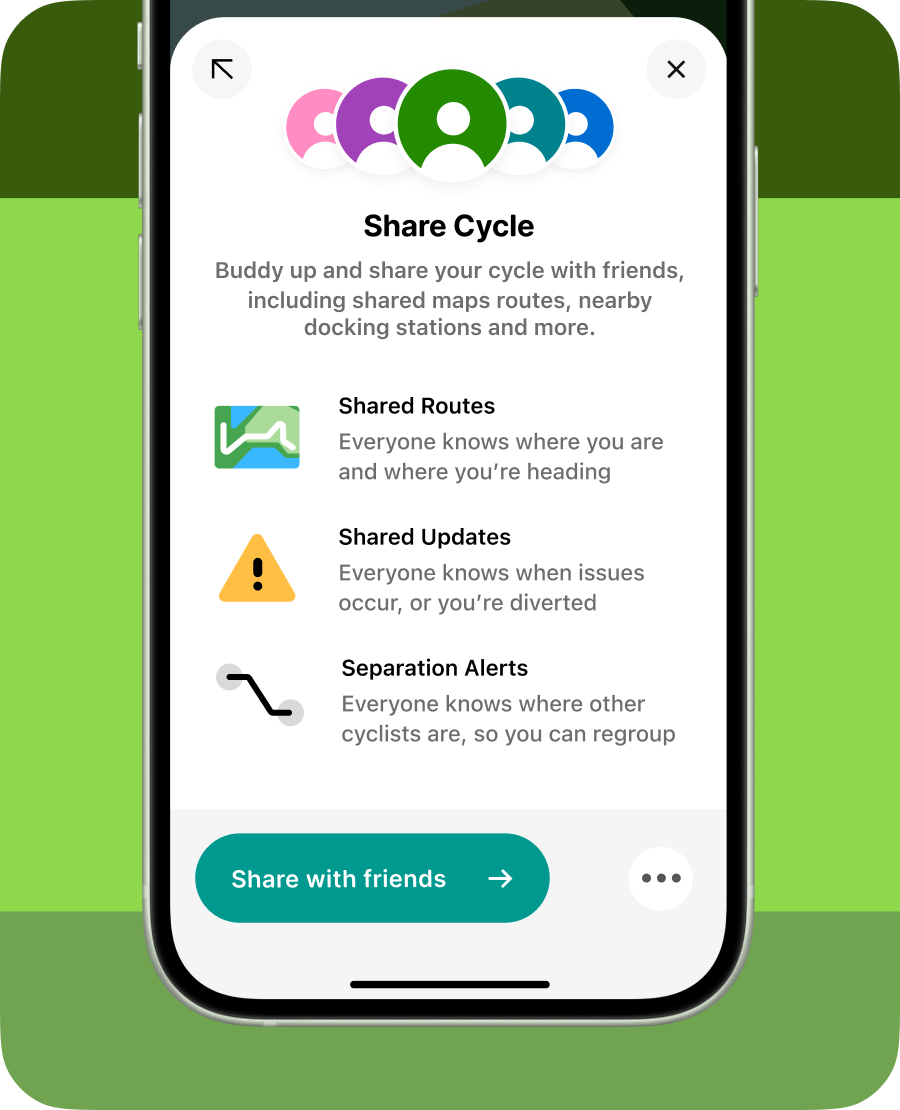
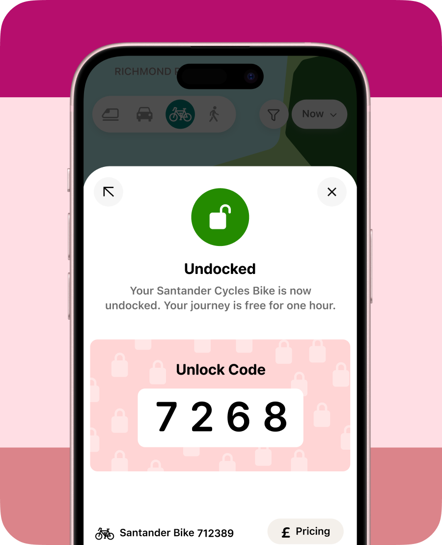
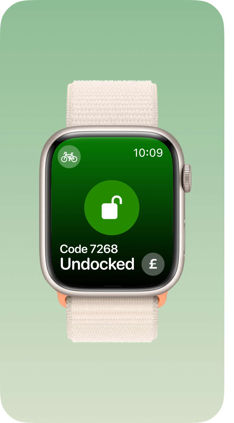
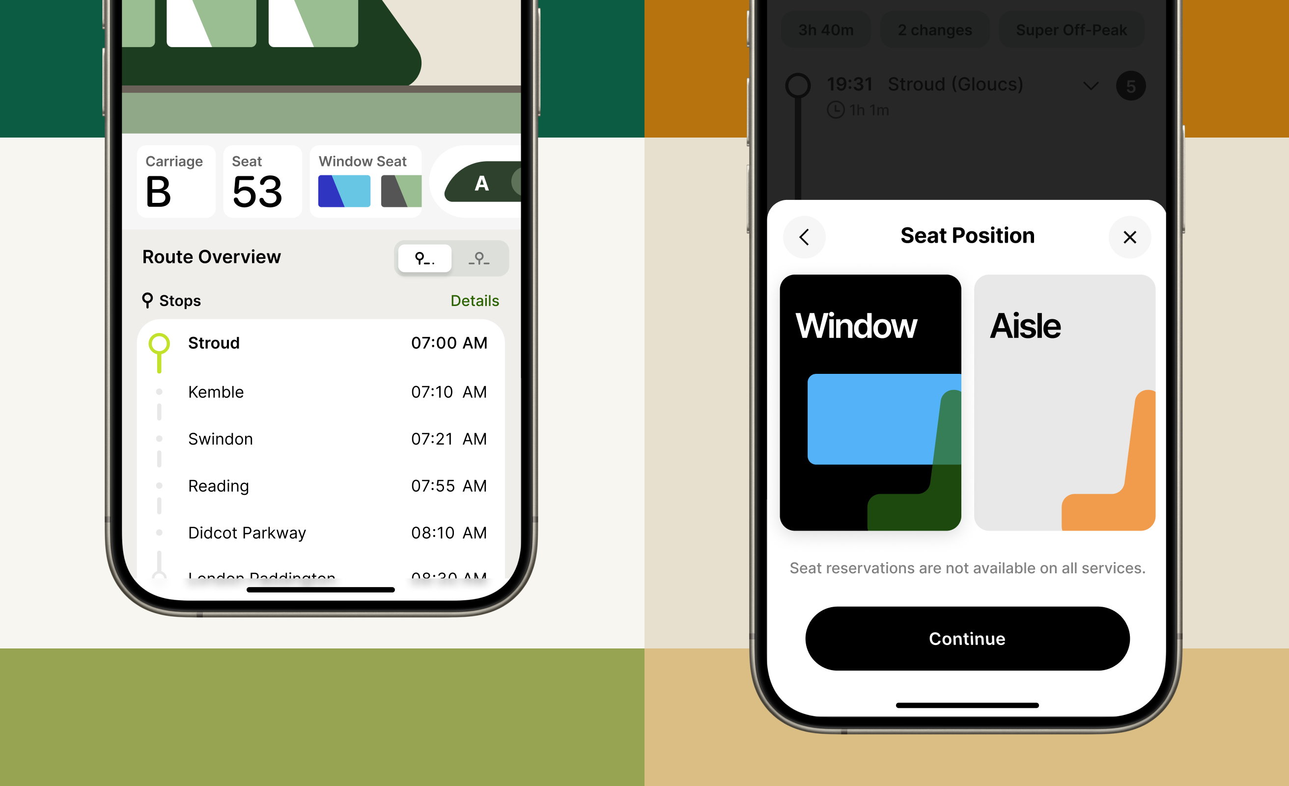
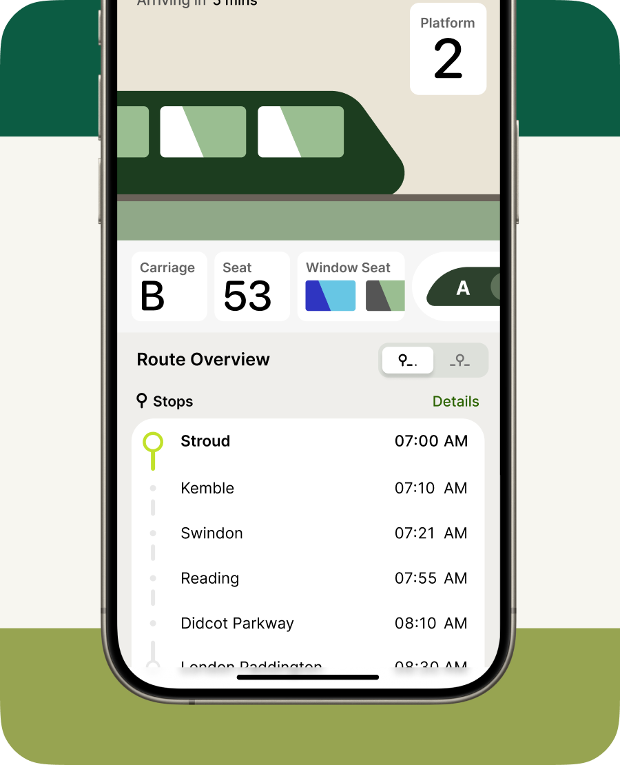
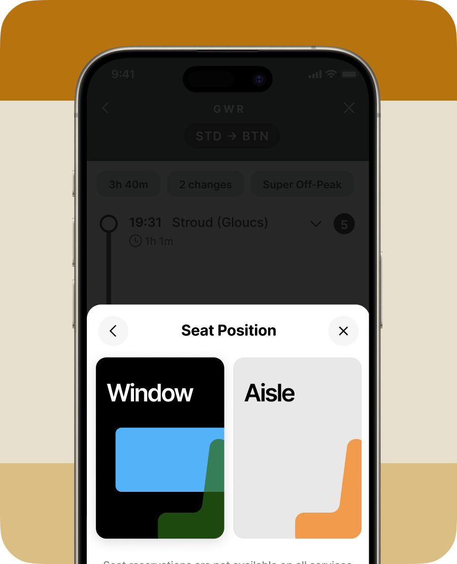
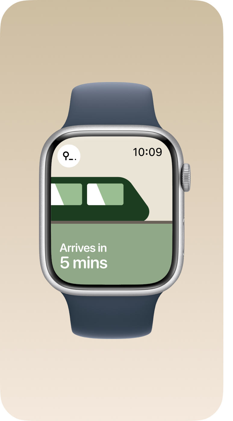
Rich, vibrant visuals – to help with quick visual context identification, and to reduce localisation disparity, I designed a cohesive set of rich, vibrant visuals to anchor any context.
Colour front and centre – unlike existing products, I wanted to really pull in rich visuals to improve legibility, contrast and quick utility, focusing on using neutrals, accents and action colours where they felt appopriate.
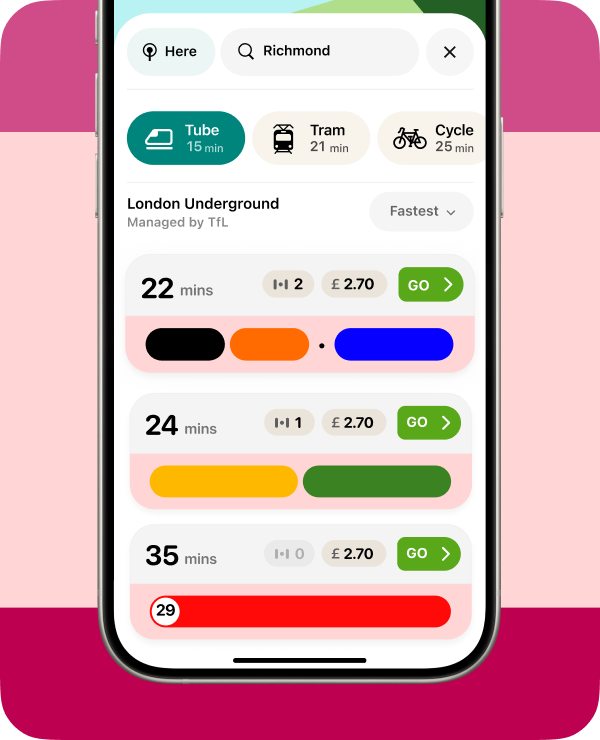
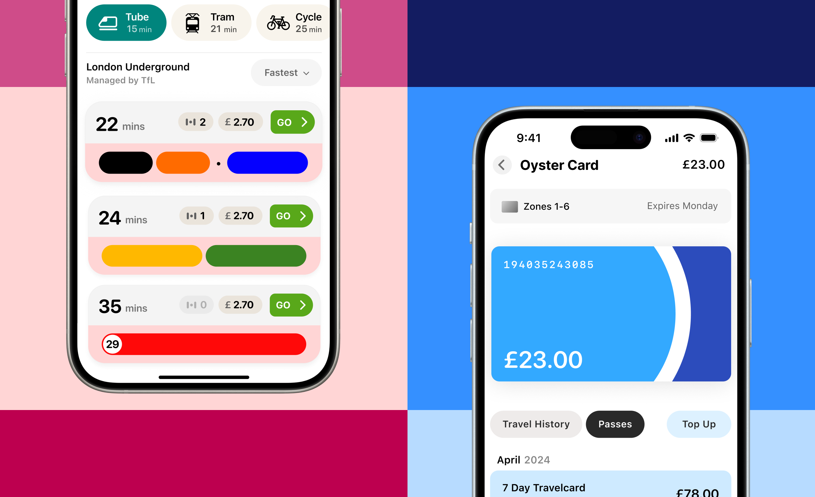
Getting users from A to B in a delightful way
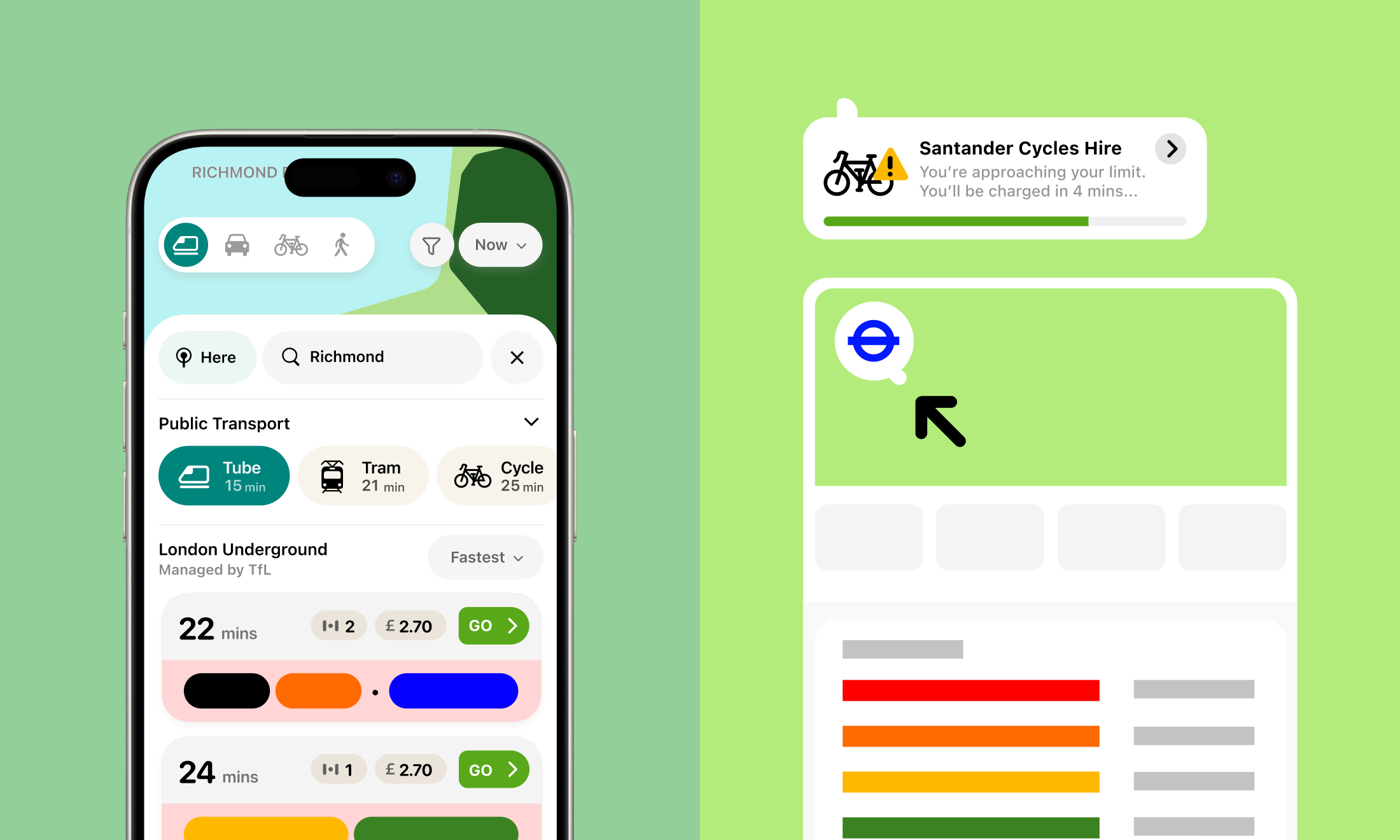
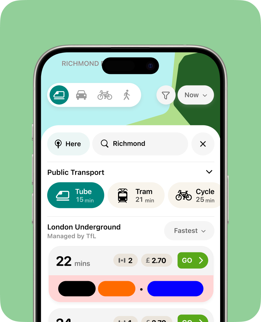
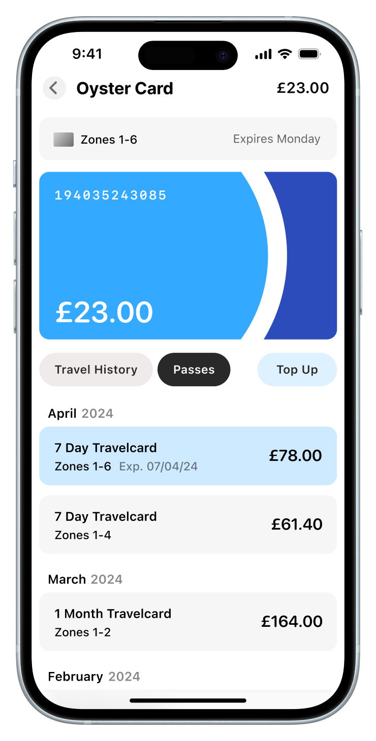
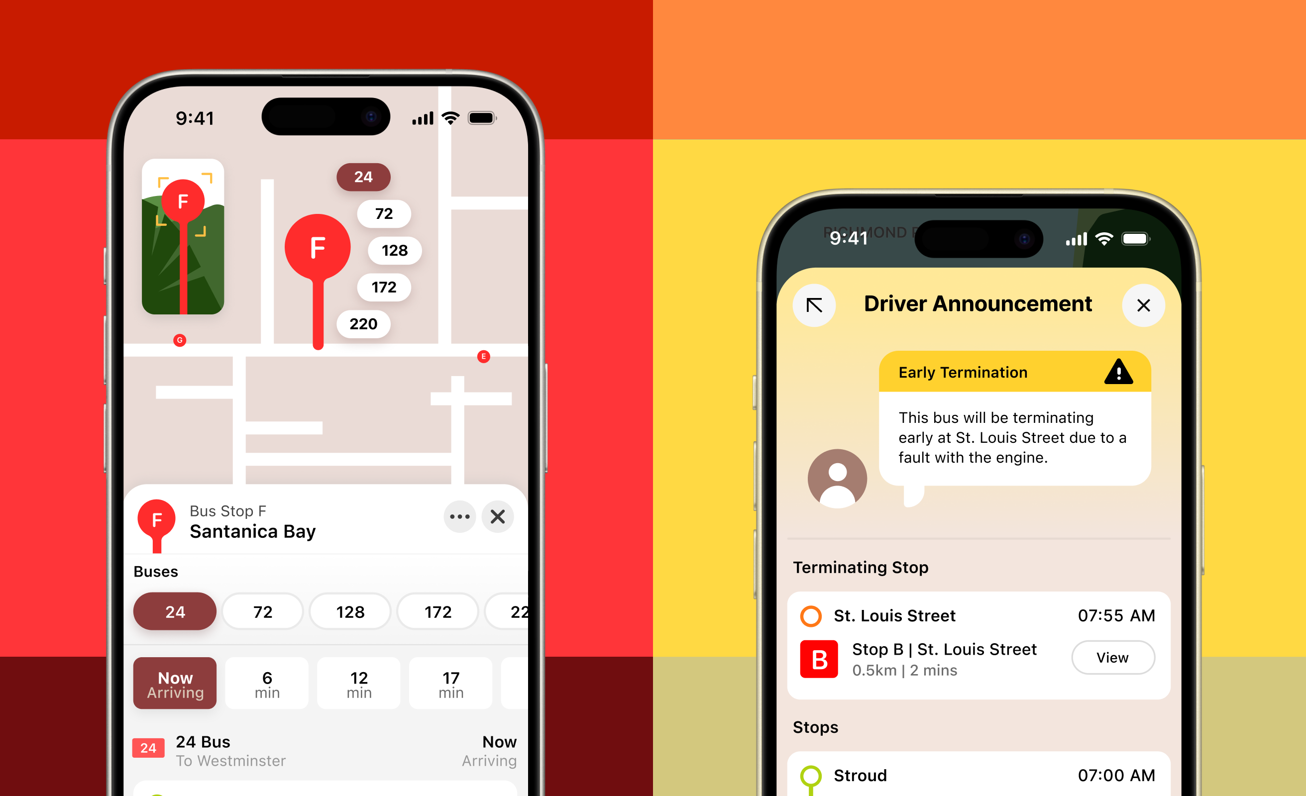
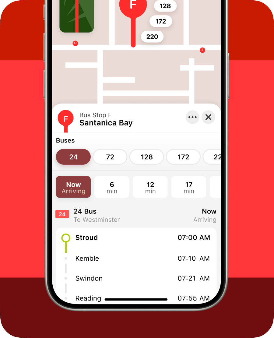
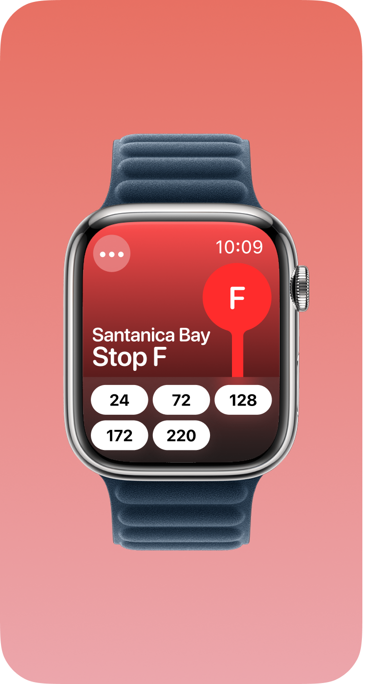
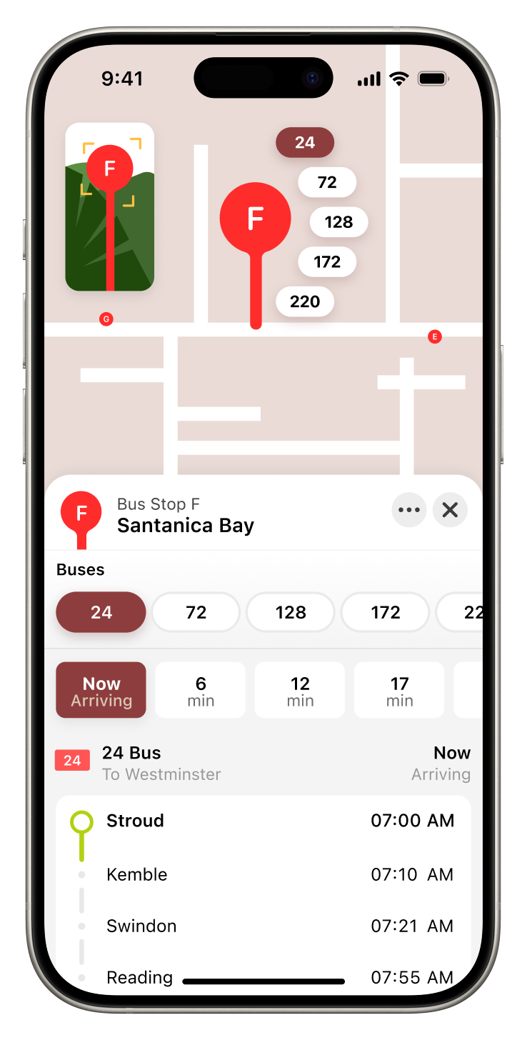
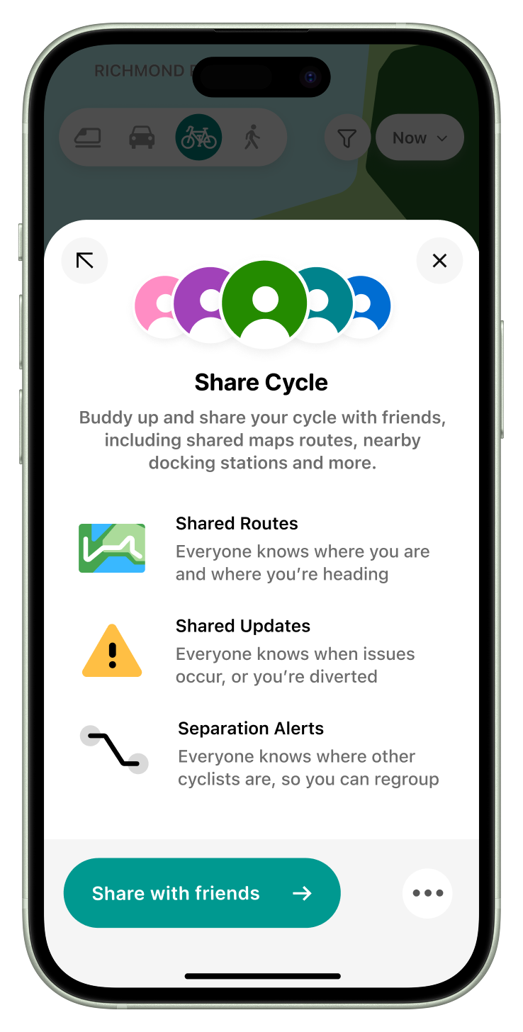
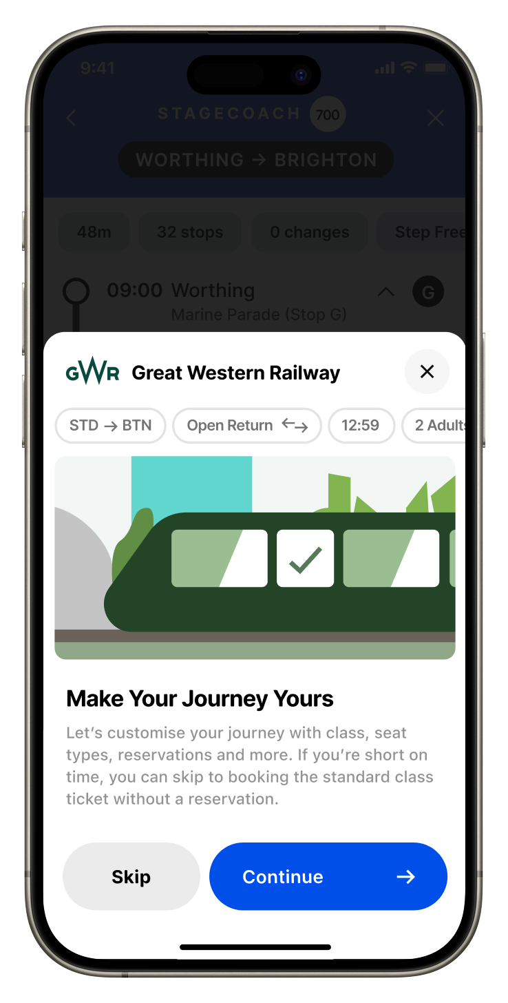
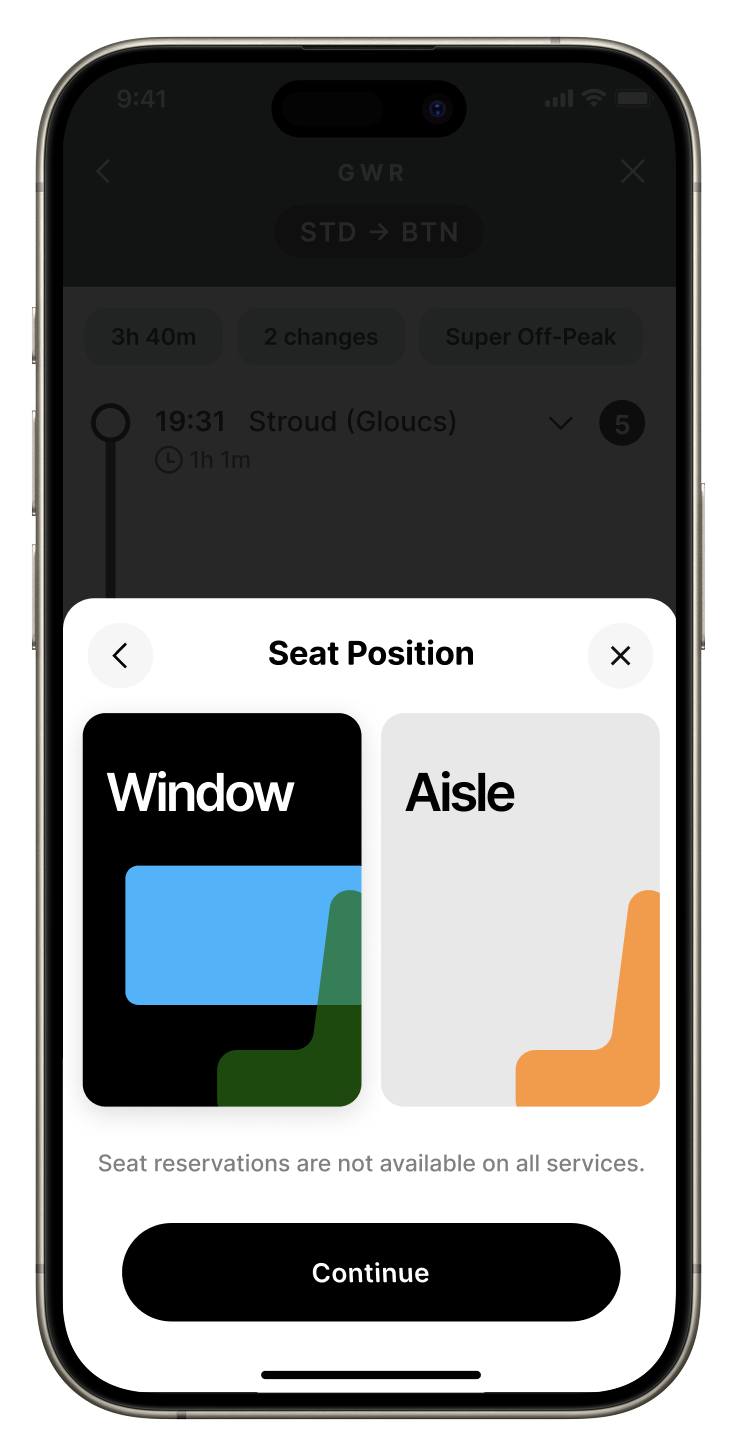
Aytobee explores a more cohesive, easy to understand experience for interfacing with different transport methods and providers, supported by a consistent, reliable interface that's both contextually aware, and dependable.
Through research and conversations with different transport users, I was able to form a picture of the current landscape, focusing on providing helpful utility, and a more seamless app experience with all your travel, in one app.
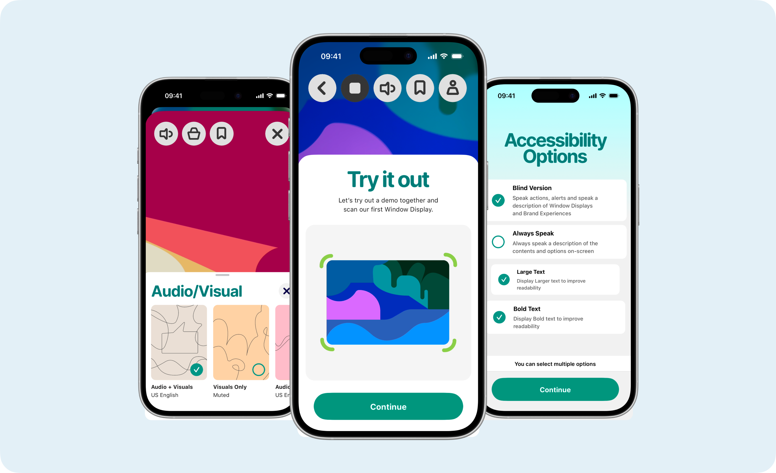
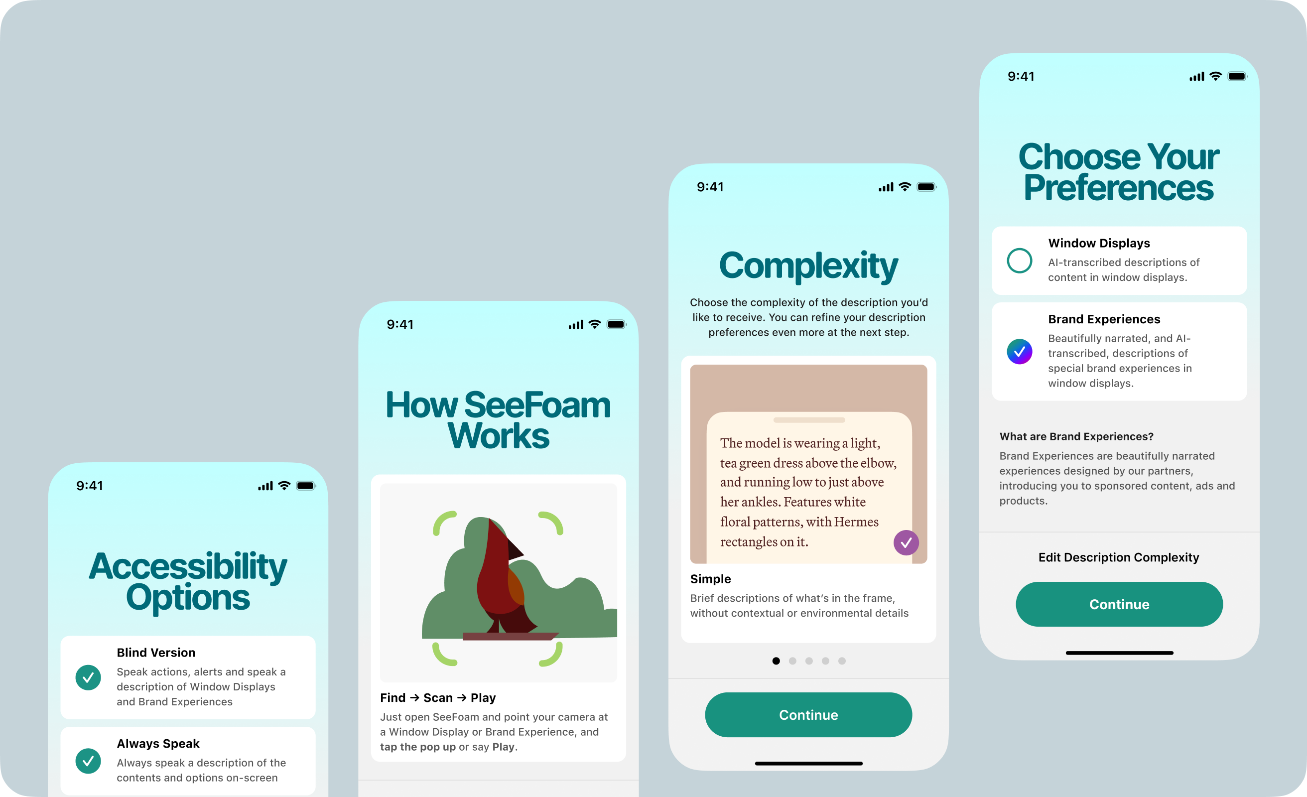
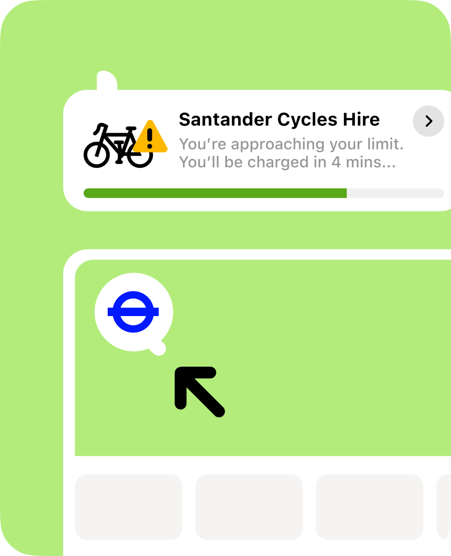
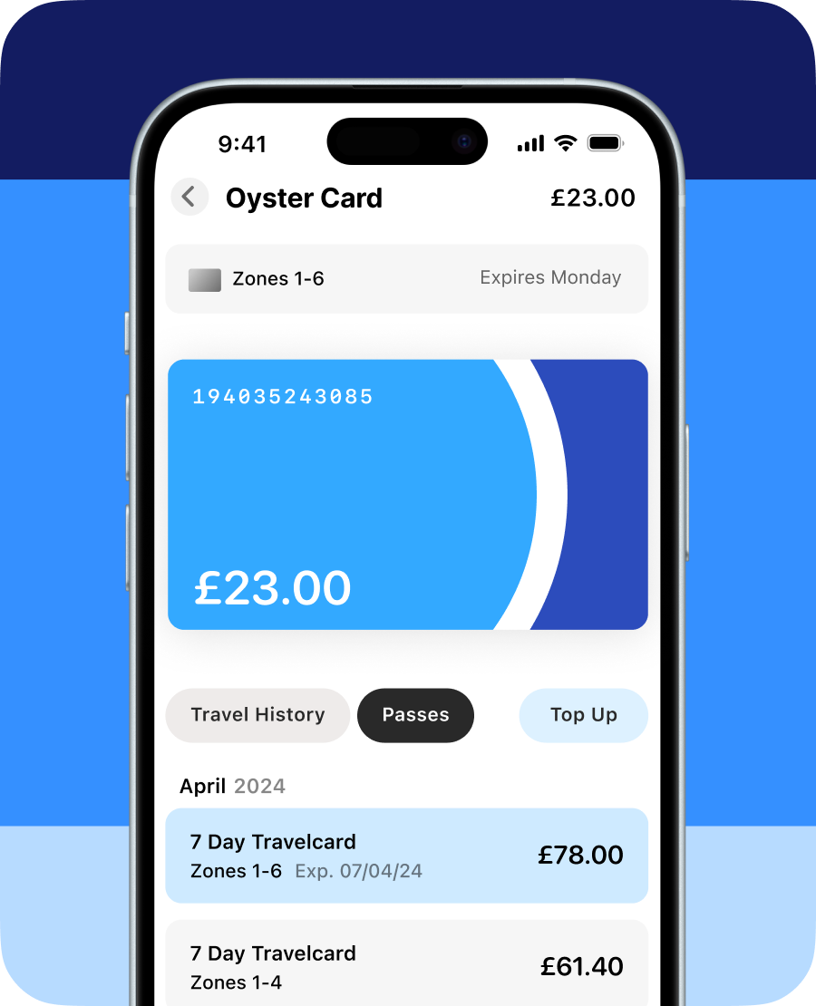
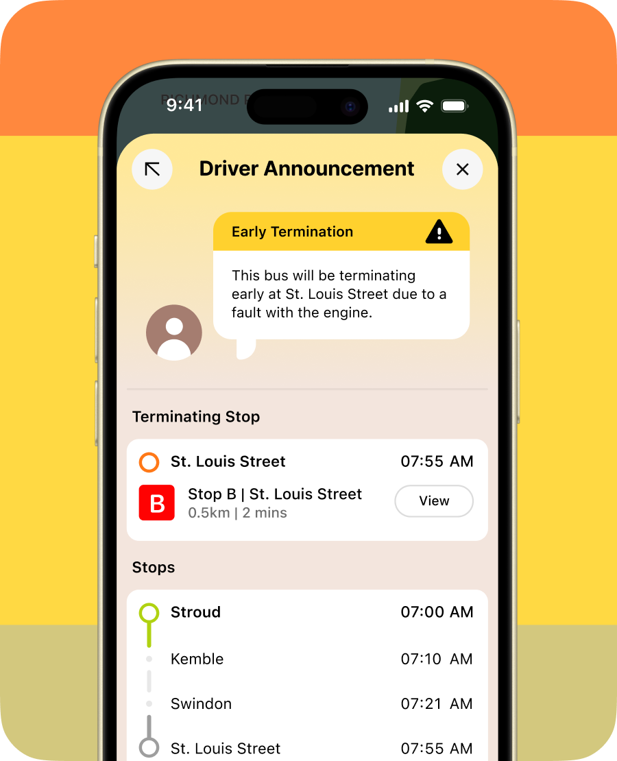
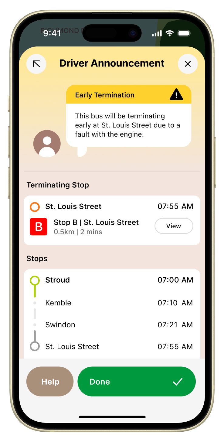
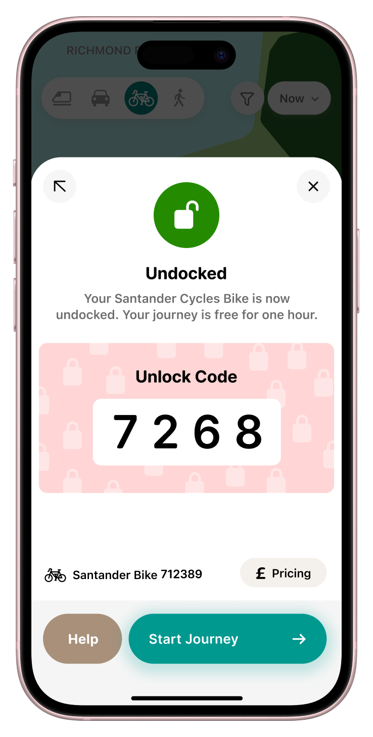
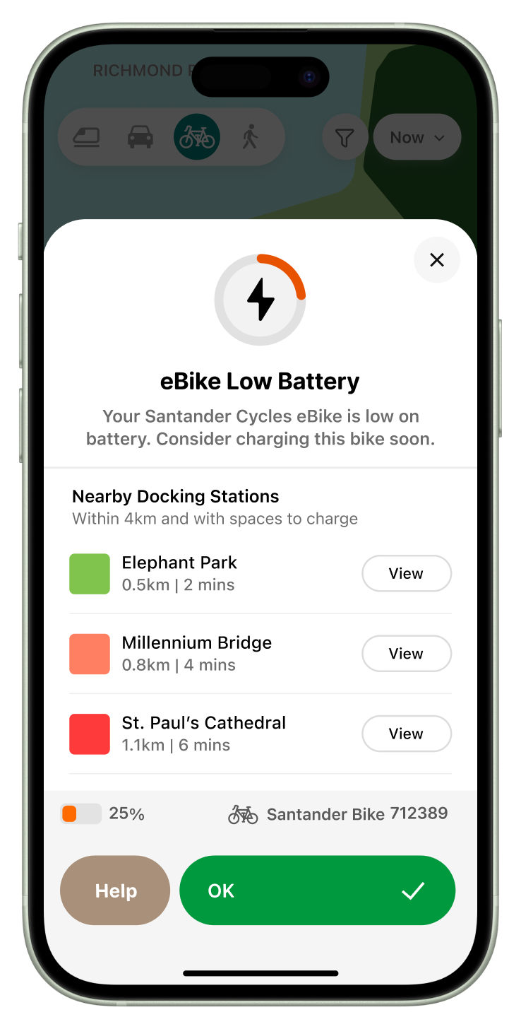
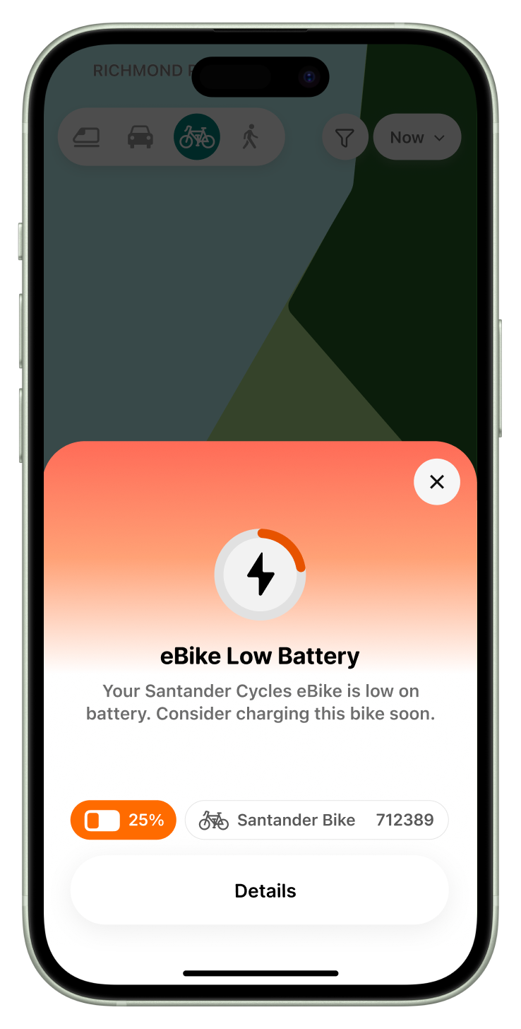
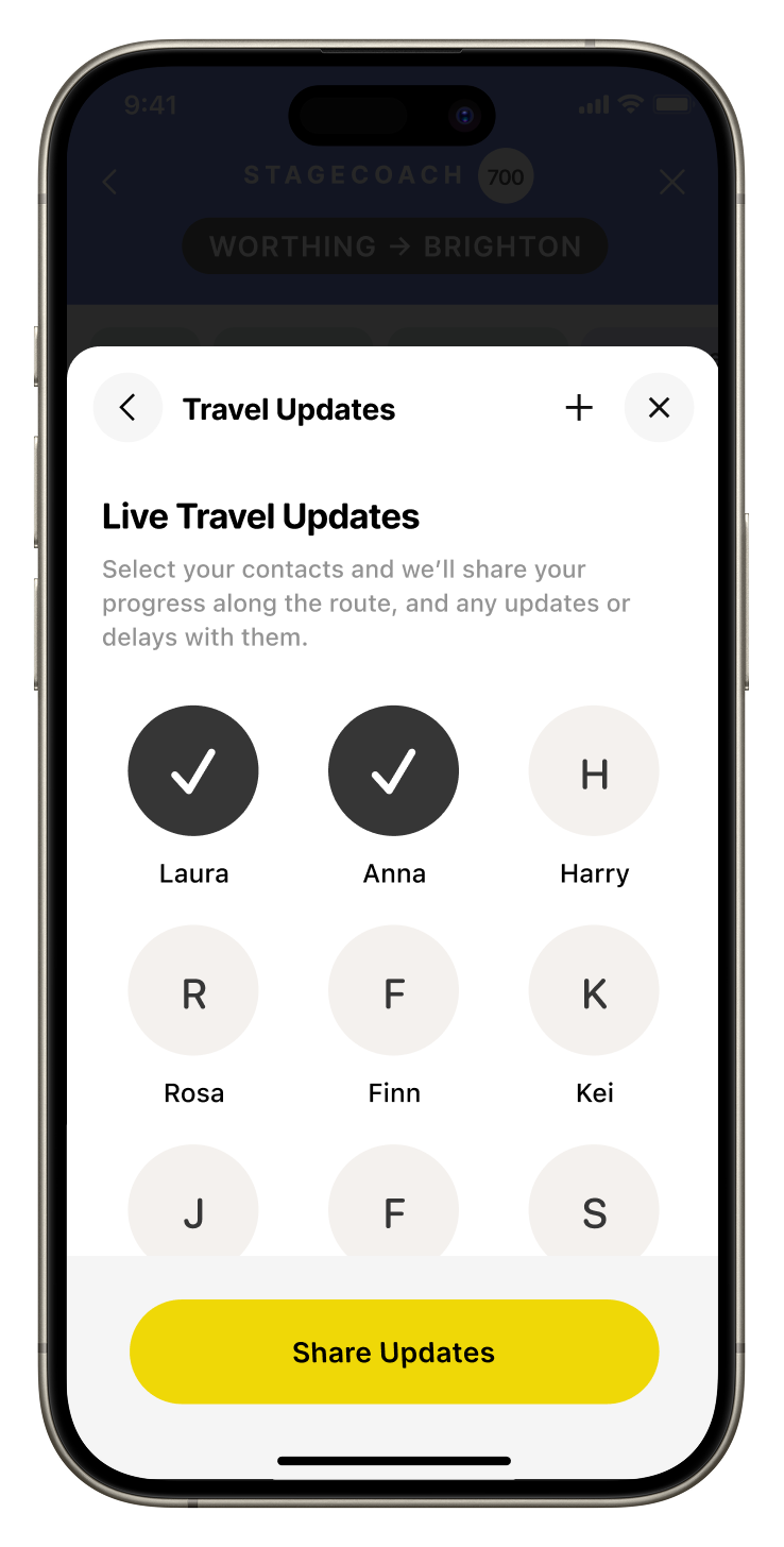
Building upon my earlier learnings from Go, I was able to design for delight, while retaining and expanding rich functionality, particularly focusing on things that could, and do, go wrong like a cancellation, delay, change of route or early termination.
Project type
UX design
Area
Travel
Platform
iOS, watchOS
Year
2025
Client
Personal
Audience
Everyone
Elements from the experience
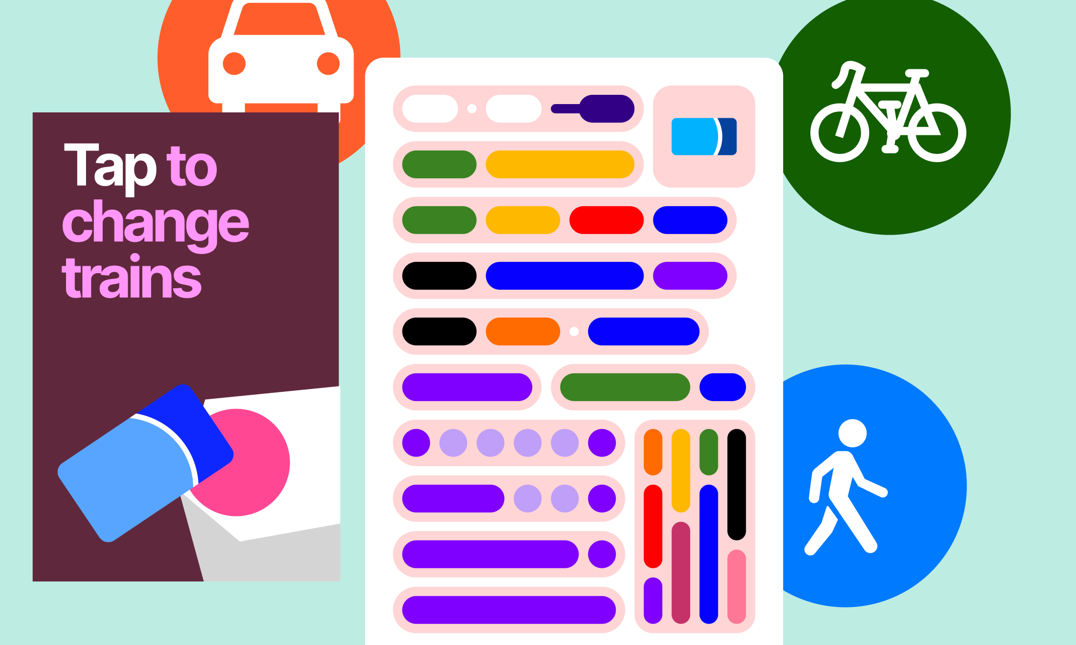
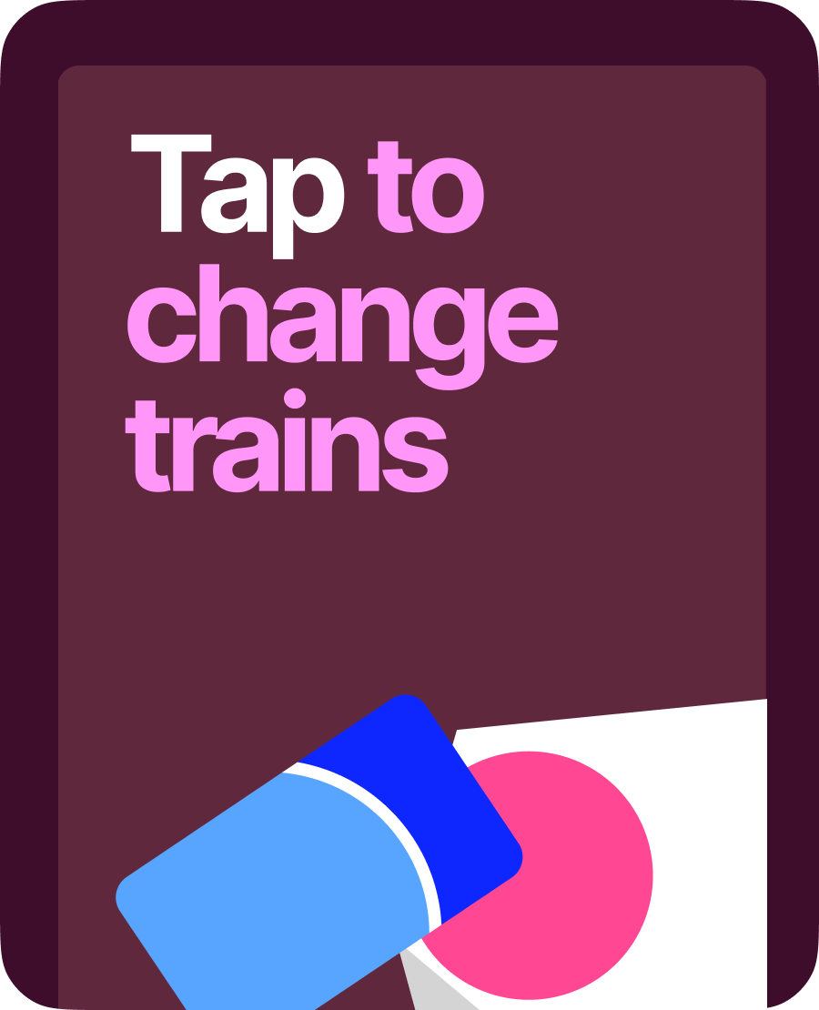
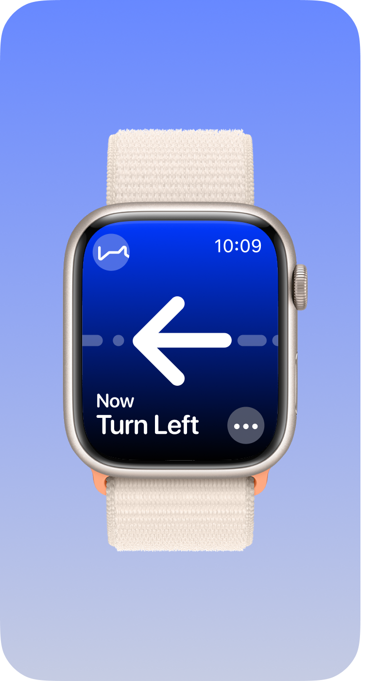
Navigation
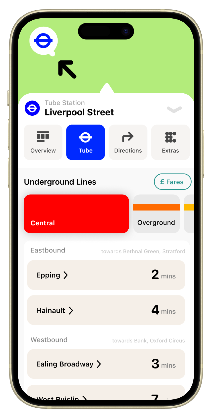
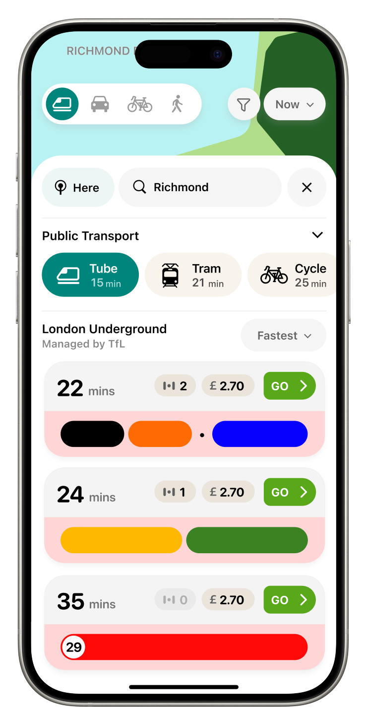
Buses
Cycling
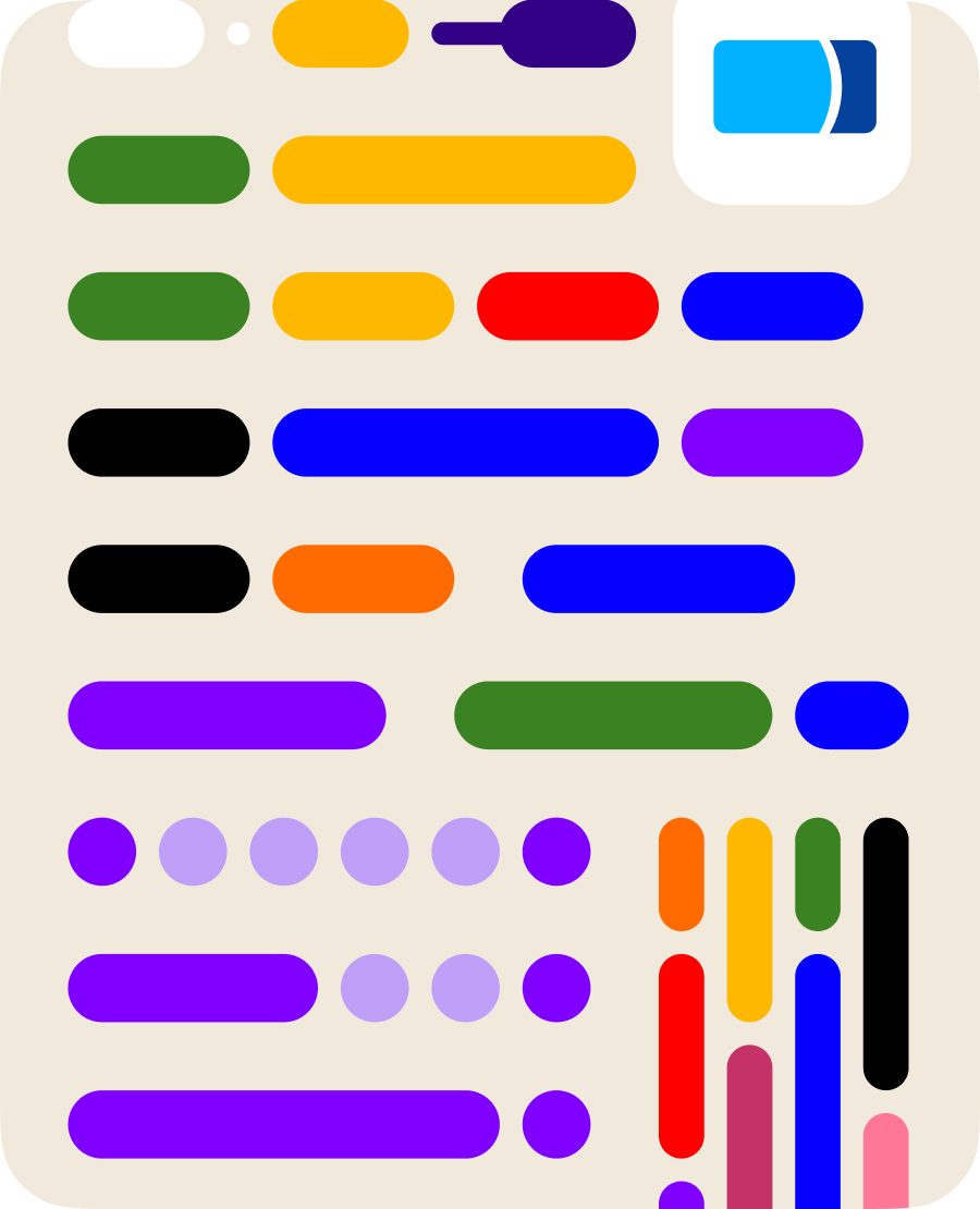
Trains
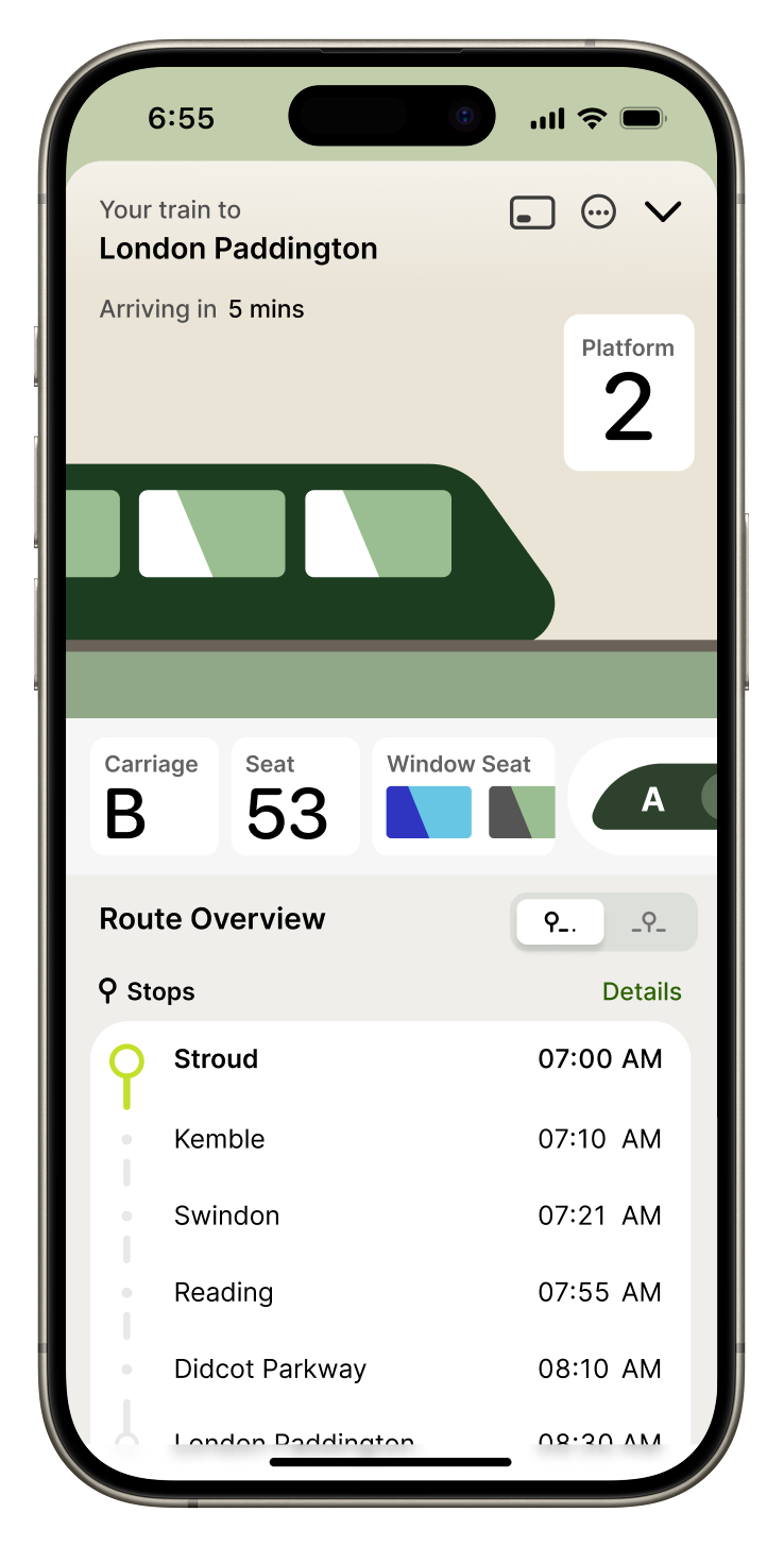
Adapts to different contexts