

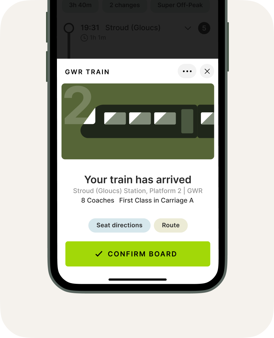
Driving visual harmony – With a simple palette that allows for an area of illustrated focus on every screen, I designed each pathway as its own story, focusing on the passenger and their goals and concerns.
Redesigning travel for the next era
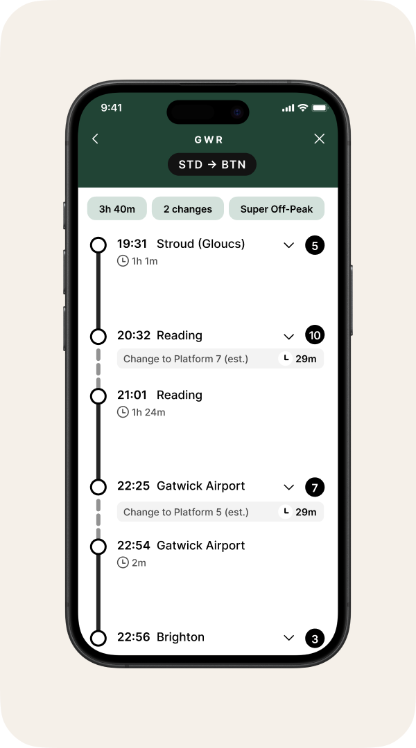
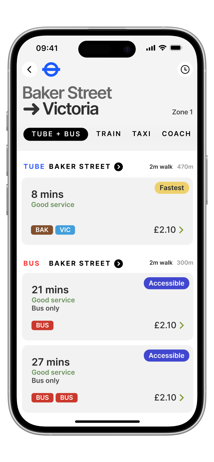
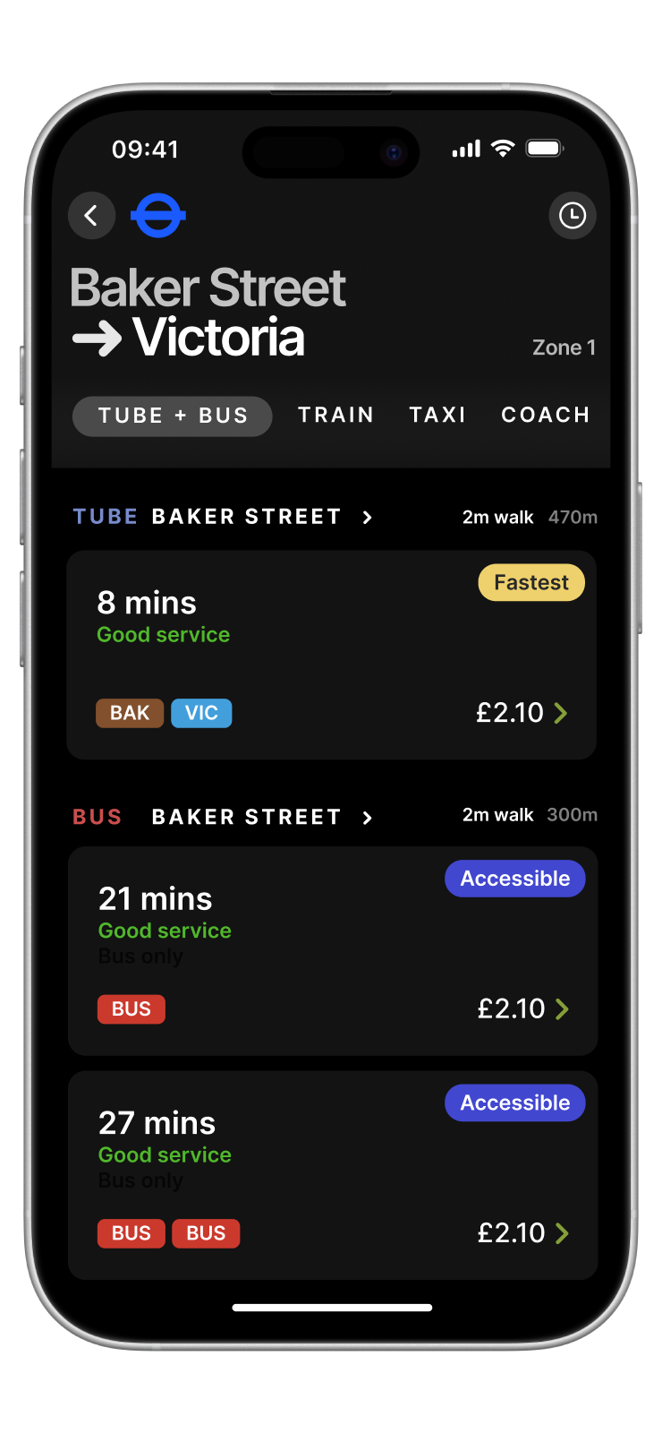
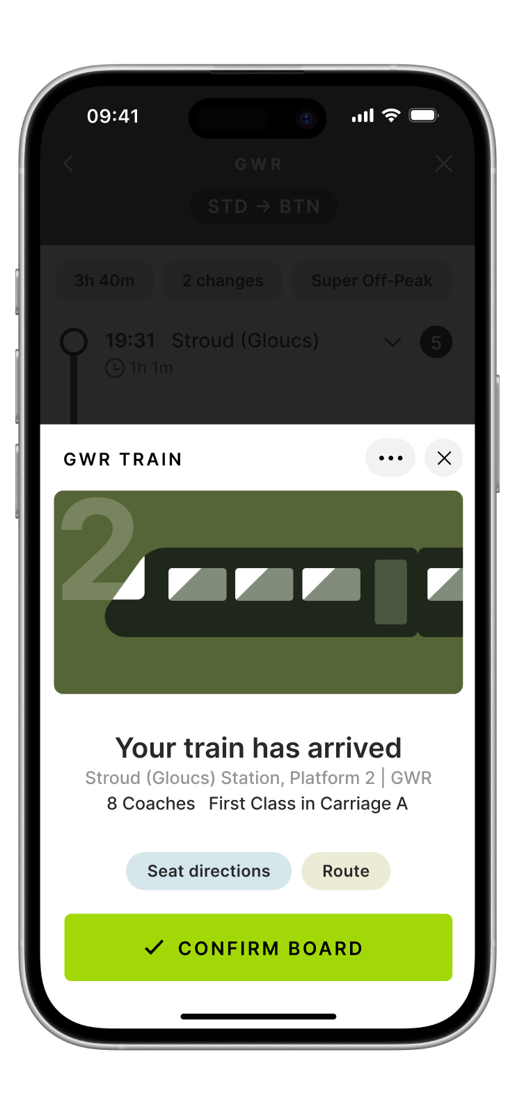
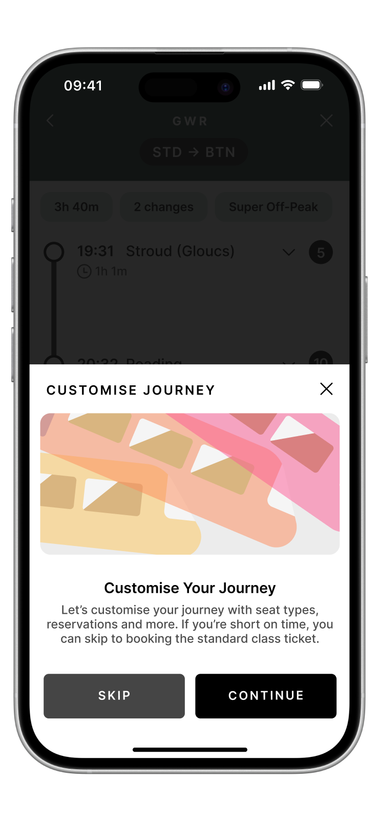
The Go Travel app concept was designed to explore the idea of a truly connected, cohesive travel experience, with one home for all travel, across all services. Focused on delivering delight, improving the experience for dyslexic and neurodivergent travellers, and with helpful new features to uplift any person on the move, Go imagines a travel experience that communicates where you are every step of the way.
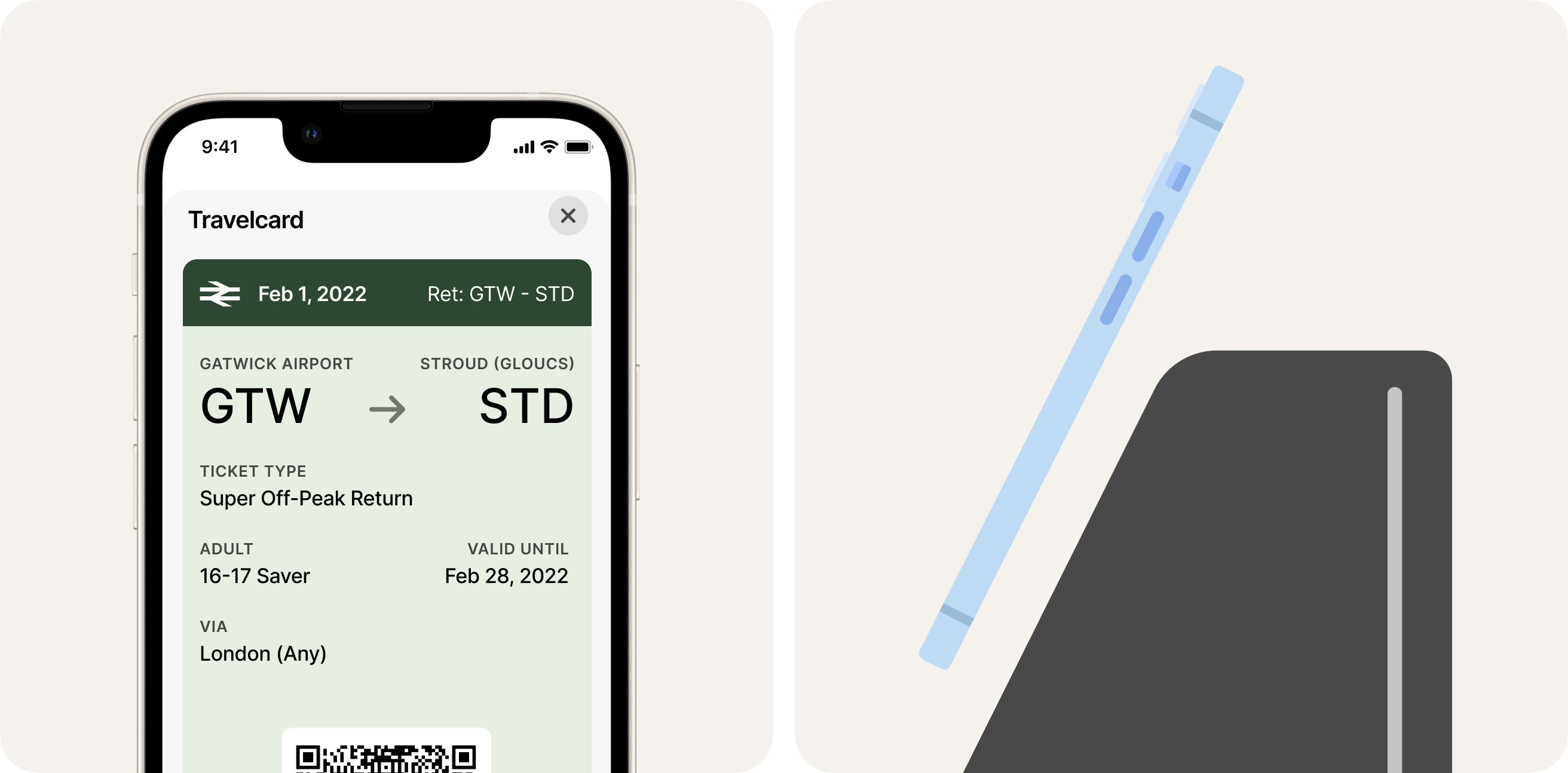
Created with rich visuals and distinct colour-matched visuals that allow individual operators to shine through, the experience is familiar and recognisable across contexts, with a consistent underlying system that moves in concert throughout any mode of travel.
Project type
UX design
Area
Transport
Platform
iOS
Year
2022
Client
Personal
Audience
Everyone
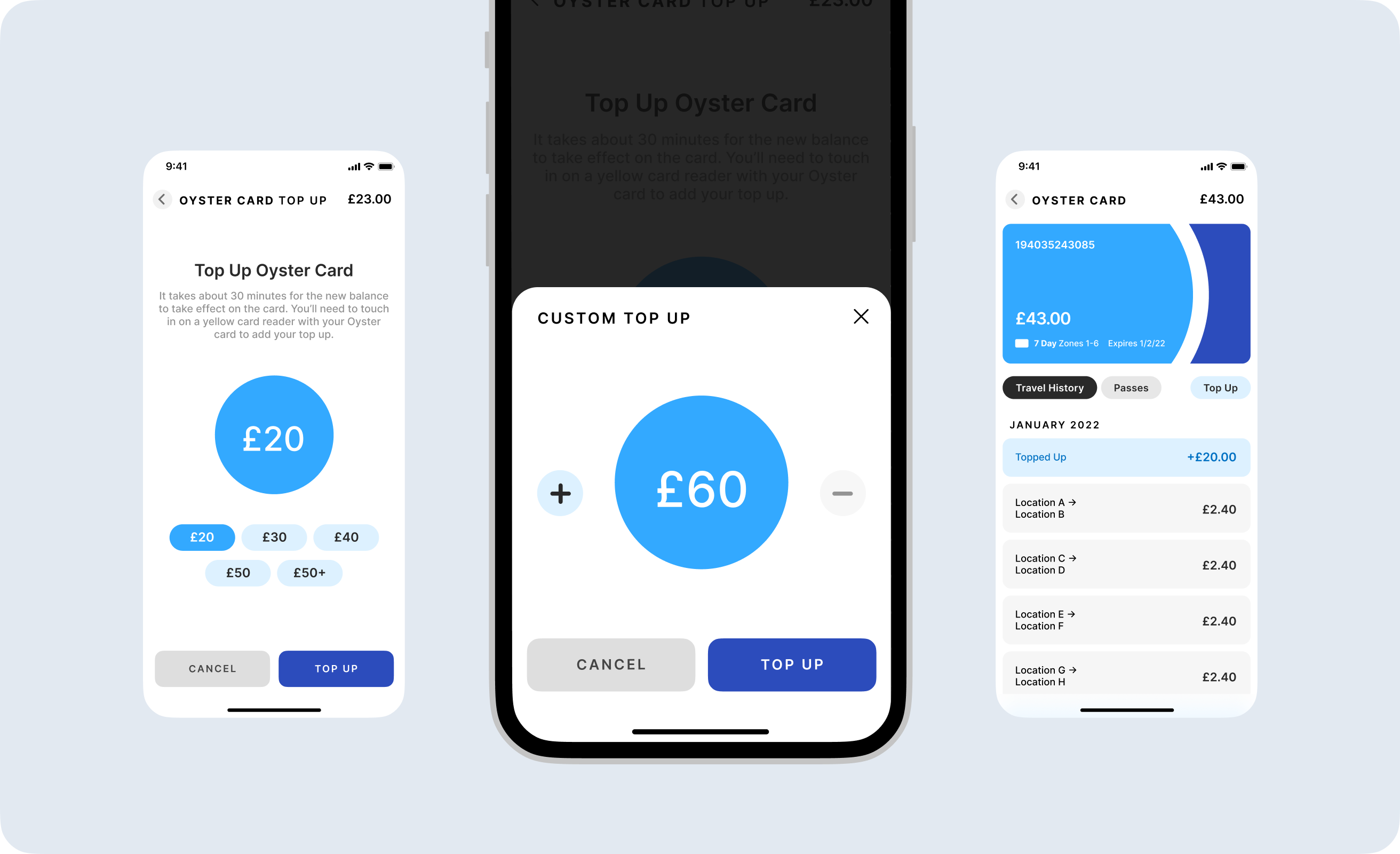
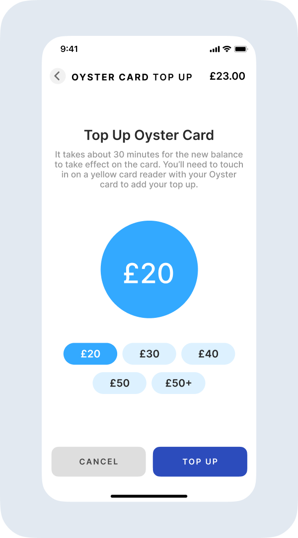

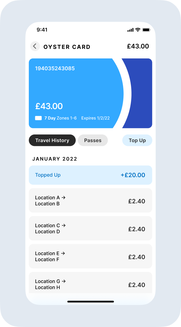
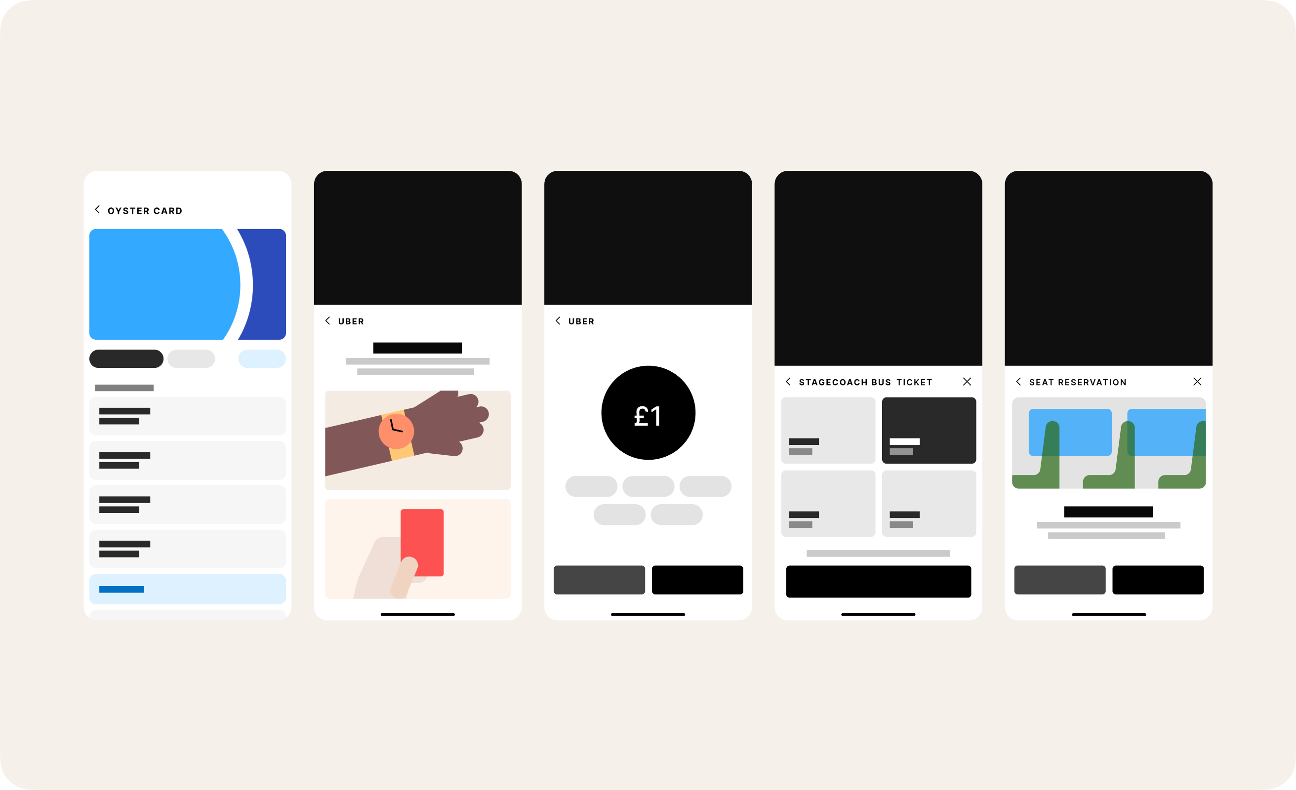
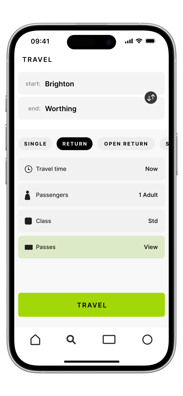
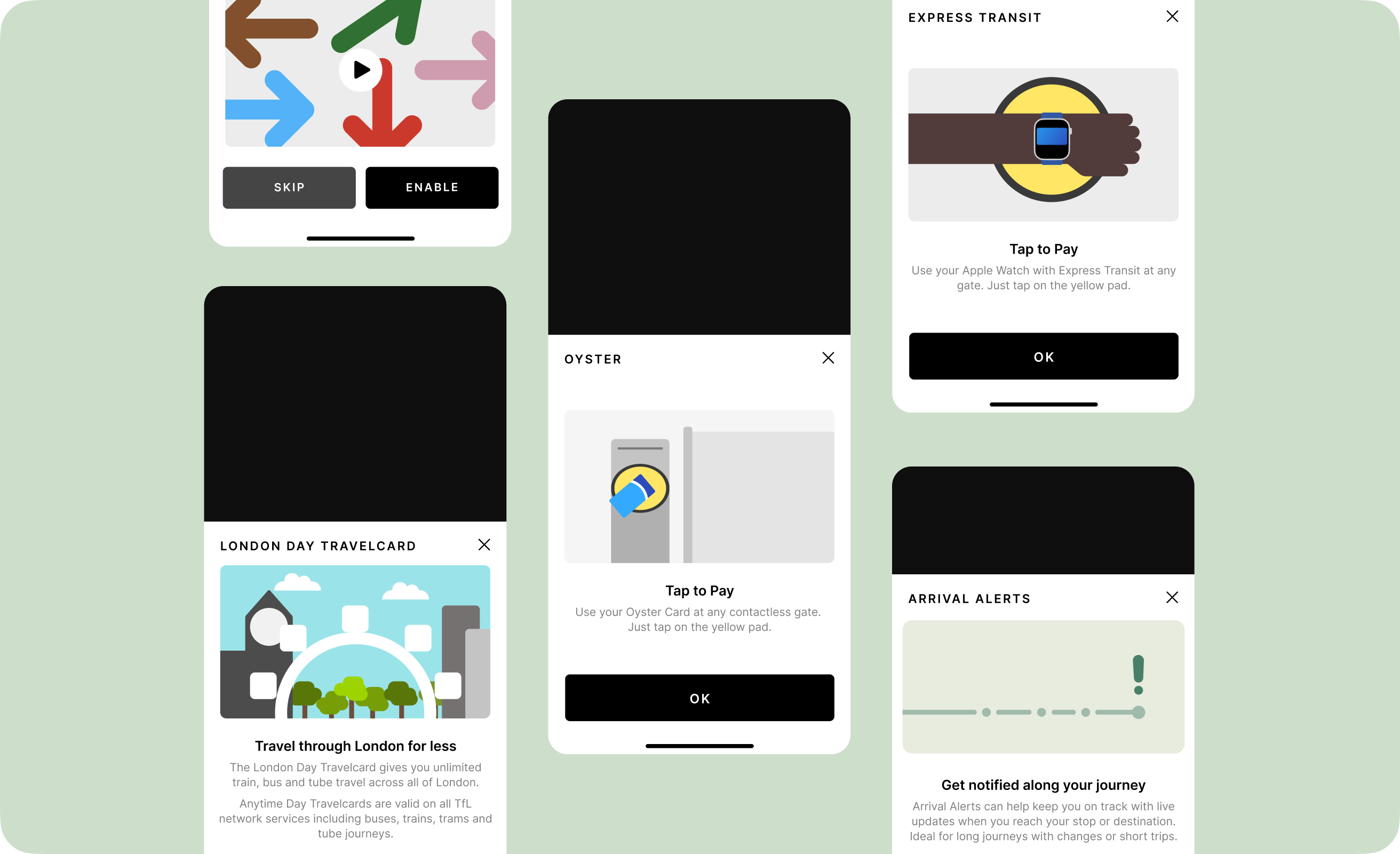
Enhancing Oyster – Often neglected, I wanted to bring speed and ease to the top up, journey history, and passes experience for Oyster Card.
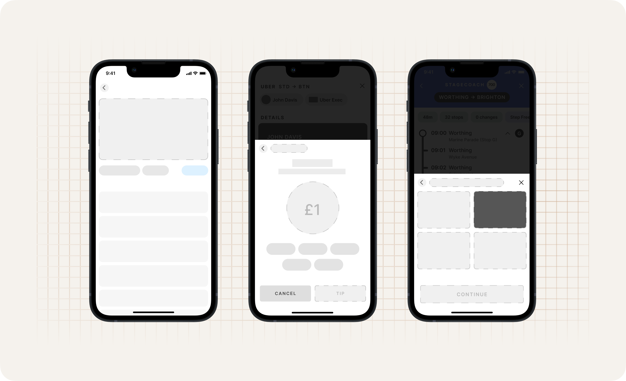
The highlights.

Screens.


Crafting the visual language for movement


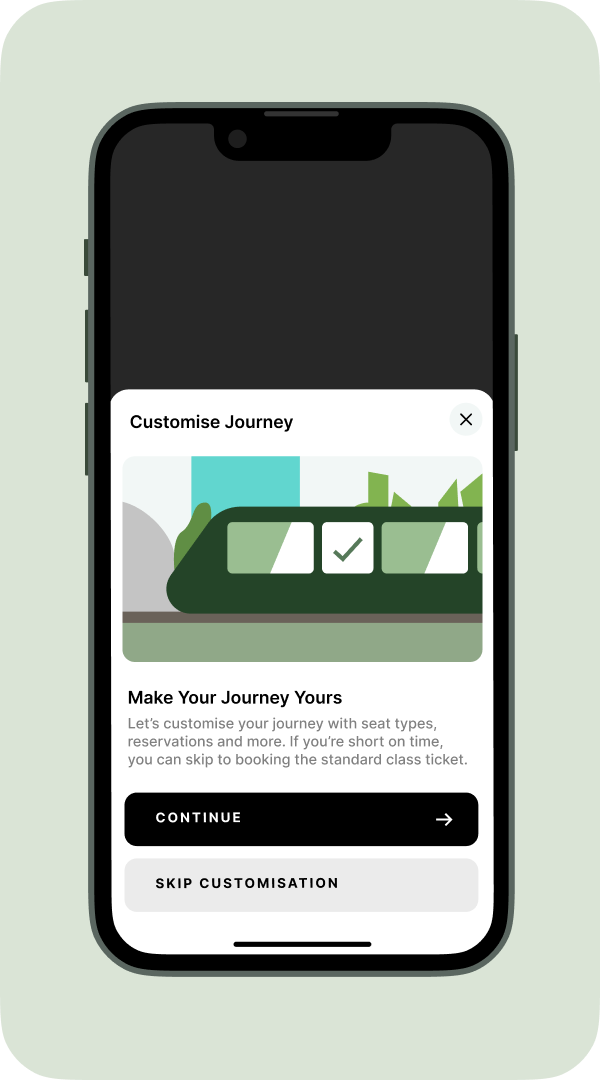
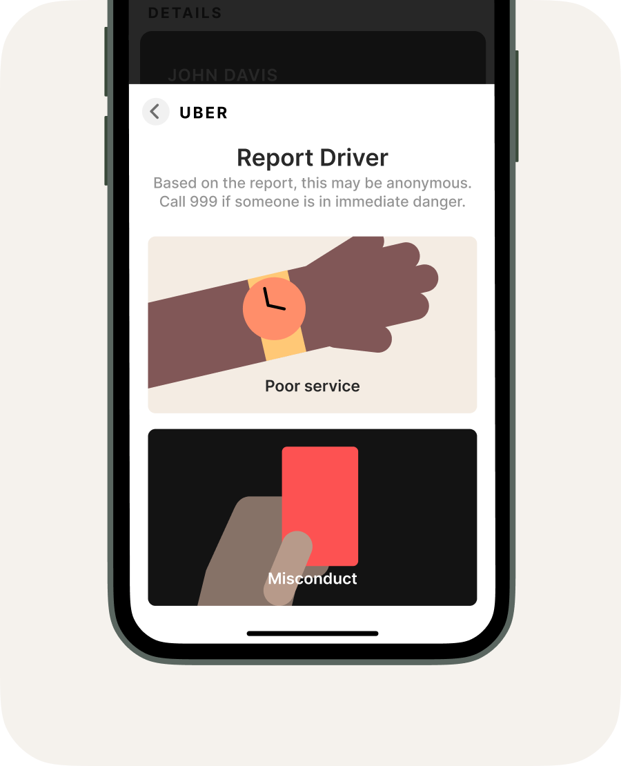
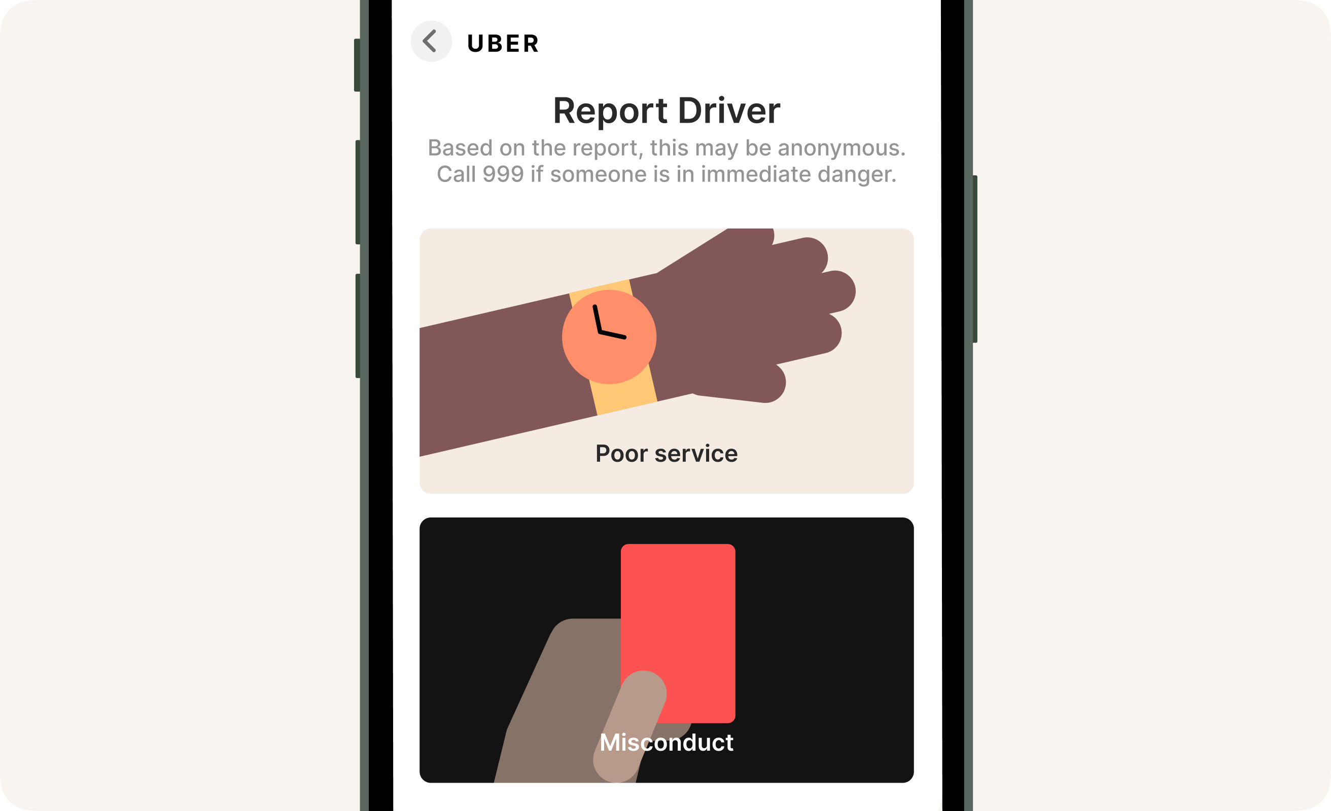
Celebrating expressive moments

Bringing joy to the mundane – I focused on using illustration and rich visuals to uplift conventionally mundane experiences, and to tie together the travel experience, across providers and transport methods, under one umbrella.
Intelligently modular

A customisable template – I designed the new design system for Go with customisation and brand expression in mind. Modular elements across the system allow for brand elements, accents and iconography distinct to the transport provider.